問題:
可能原因:
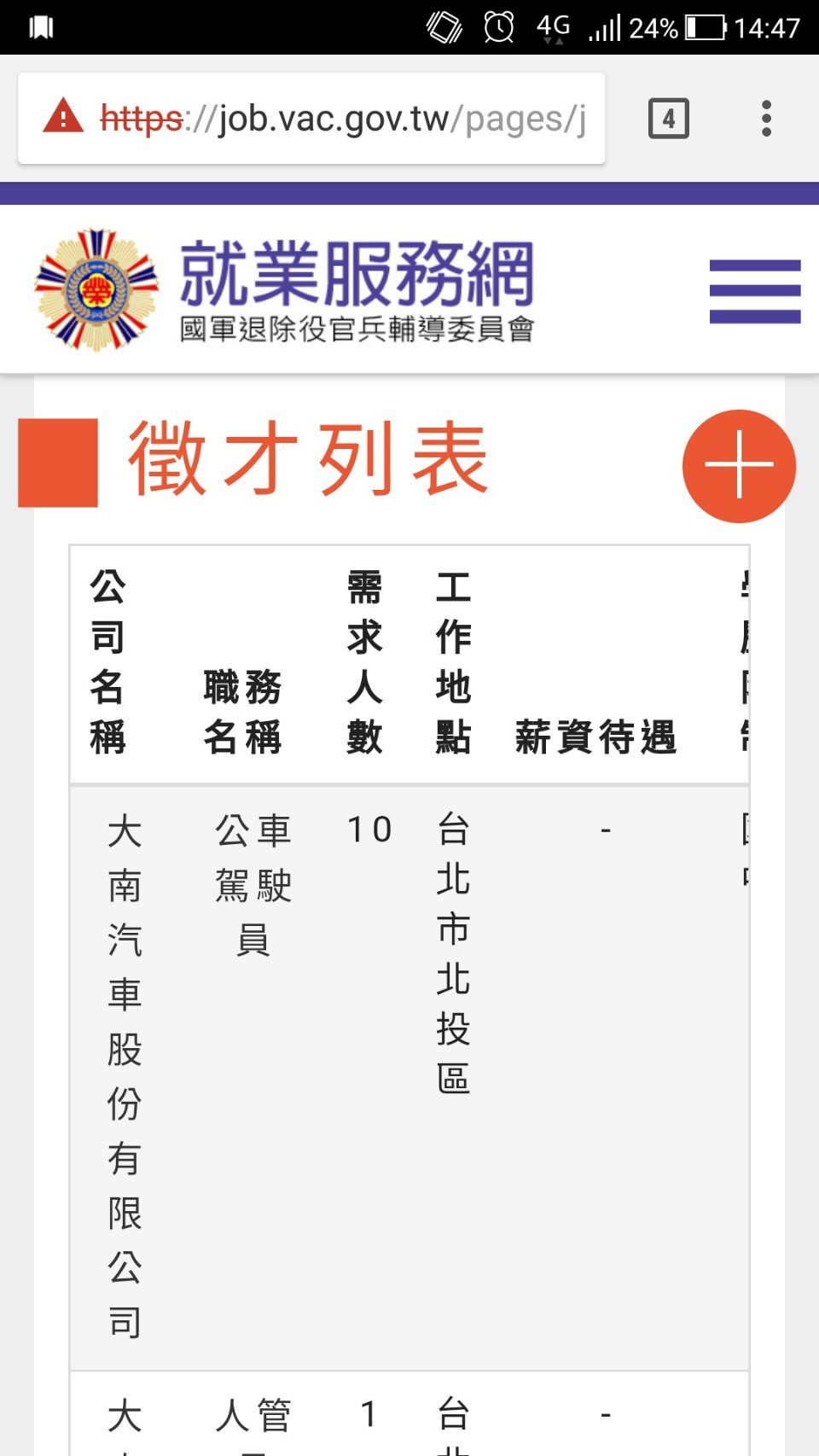
上方表格有設置水平滾輪供使用者滑動檢視,但表格內容不多,其實可以直接縮減表格寬度就好。
原始程式:
位置:https://job.vac.gov.tw/css/bootstrap.min.css:5
@media screen and (max-width: 767px)
.table-responsive>.table>tbody>tr>td, .table-responsive>.table>tbody>tr>th, .table-responsive>.table>tfoot>tr>td, .table-responsive>.table>tfoot>tr>th, .table-responsive>.table>thead>tr>td, .table-responsive>.table>thead>tr>th {
    white-space: nowrap;
}
建議修改:
將此行註解掉。
@media screen and (max-width: 767px)
.table-responsive>.table>tbody>tr>td, .table-responsive>.table>tbody>tr>th, .table-responsive>.table>tfoot>tr>td, .table-responsive>.table>tfoot>tr>th, .table-responsive>.table>thead>tr>td, .table-responsive>.table>thead>tr>th {
    /* white-space: nowrap; */
}
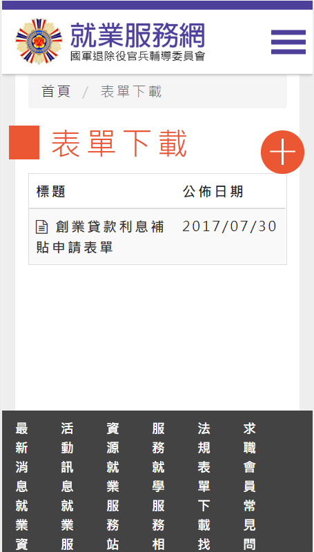
補充:
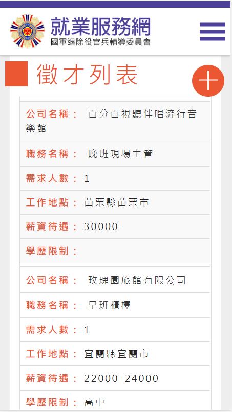
(修正後之截圖)
問題:
可能原因:
表格內容裡的數字欄位無法自動換行,且文字內容過度換行,不便使用者閱讀。
原始程式:
位置:view-source:https://job.vac.gov.tw/pages/job_list.aspx?ty=jb&nb=1
73行
<table class='table table-striped table-hover'>
<thead>
<tr>
<th width='25%'>公司名稱</th>
<th width='25%'>職務名稱</th>
<th width='10%'>需求人數</th>
<th width='15%'>工作地點</th>
<th width='15%'>薪資待遇</th>
<th width='10%'>學歷限制</th>
</tr>
</thead>
.
.
.
(以下省略)
建議修改:
將表格結構重新排列,解法如下:
- 在
<style>...</style>之間放入:
@media (max-width: 736px) {
  .table-rwd{min-width: 100%;}
  /*針對tr去做隱藏*/
  tr.tr-only-hide {display: none !important;}
  .table-rwd tr{
    display: block;
    border: 1px solid #ddd;
    margin-top: 5px;
    }
  .table-rwd td {
    text-align: left;
    font-size: 15px;
    overflow: hidden;
    width: 100%;
    display: block;
    }
   .table-rwd td:before {
    content: attr(data-th) " : ";
    display: inline-block;
    text-transform: uppercase;
    font-weight: bold;
    margin-right: 10px;
    color: #ea5732;
  }
  .table-rwd.table-bordered td,.table-rwd.table-bordered th,.table-rwd.table-bordered{border:0;}

}
- 在
<table class" ... ">裡加入"table-rwd":
<table class="table table-striped table-hover table-rwd">
- 在
<tr class" ... ">裡加入"tr-only-hide":
<tr class="tr-only-hide">
- 表格內容更改如下:
<tr>
<td scope="row" data-th="公司名稱"><a getpage="" href="./job_detail.aspx?bb=ls&cc=21&js=8"><span>百分百視聽伴唱流行音樂館</span></a></td>
<td data-th="職務名稱"><a getpage="" href="./job_detail.aspx?bb=ls&cc=21&js=8"><span>晚班現場主管</span></a></td>
<td data-th="需求人數">1</td>
<td data-th="工作地點">苗栗縣苗栗市</td>
<td data-th="薪資待遇">30000-</td>
<td data-th="學歷限制"></td>
</tr>
參考來源:Rwd Table https://codepen.io/floraya/pen/YwoEEZ
補充:
(修正後之截圖)